Google is releasing a new update to its search engine algorithm – one that industry insiders are touting as so big, it could wreck online businesses overnight, IF, they aren’t prepared!
The update has been dubbed ‘mobilegeddon’, or ‘mobilepocalypse’, depending on who you speak to. In essence, as you probably guessed from the name, it is focused on mobile search results.
First, however, let’s cover some background.
Google is a search engine – this much everyone knows. The way it works though is to have a very complex and intelligent algorithm that assesses a user’s query against its database of websites (which is the biggest online!). It can then assess which sites best match that users query, and give them the best result. Google has been the best at this for years, which is why it has been the #1 search engine in most of the world for the last 10 years.
However, people then started realising the potential benefits of tricking Google into displaying their results first. Lots of visitors = lots of cash. This started to cause spammy, unhelpful websites to rank on page 1. This wasn’t good for Google or it’s users, so Google is in a constant battle with trying to prevent useless and unhelpful results from appearing on page 1.
In recent years, there have been hundreds of smaller updates and refreshes to its formula, but the two most notable have been named ‘Panda’ and ‘Penguin’. Panda looks at your actual website; the structure, linking between pages, the content and keyword density, meta-tags and all other sorts of bits. It can quickly tell if the website owner is attempting to ‘hack’ the system by stuffing keywords or setting up in a non-natural way. Penguin looks at the links pointing to your site; the amount of them, the quality of them, the anchor text used, and even the links pointing to the sites which point at yours! It can tell if a backlink profile looks natural or spammed.
These two updates caused massive upheavals for a lot of business on the internet when they were released. For example, before Panda was released, if you were wanting your site on fireplaces to rank on page 1, you could just repeat the word ‘fireplaces’ hundreds of times, have it in your meta-tags again and again, and just produce masses of useless pages with content which is copied from a hundred other websites all looking the same. Panda knocked sites like these off the entire index. Before Penguin, you could have a small fireplace website, point a million links from rubbish websites all over the globe (even in other languages), and Google would give you the page 1 spot. Nowadays, it can tell it’s all fake, and you won’t last very long.
The new mobile-friendly update for Google
The update due for release on 21st of this month (April 2015), is set to be bigger than Panda and Penguin put together. And it is all to do with mobile-friendly websites.
This means if your website isn’t responsive, and mobile-friendly, then it’s going to get hit by a new penalty. Google wants to see websites that look great to people browsing on mobile technologies such as smartphones, iPads, and tablets. And if your website doesn’t, then expect to see a drop in your rankings, and potentially your business!
So why is Google doing this?
Well, it actually makes sense. You see Google wants to match people to what they want quickly and easily. If it can’t do that, people will look somewhere else. For the last few years, mobile usage on the internet has been creeping up towards the same usage as people on desktops, and all at an alarming rate. In fact, last year, mobile usage surpassed desktops for the first time! Check this out:
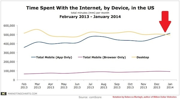
(Thanks to searchenginewatch.com for the graphic)
Google has been aware of this for some time now. So with most people accessing the internet on a screen which are generally much smaller than a PC, they want to ensure the quality stays just as good in terms of the websites it refers its users to.
So what is Google going to do?
Well, it’s impossible for people to say for sure. It’s rare Google announce refreshes to its algorithm before they happen, usually confirming them after the event (and about the time SEO guys are crying into their keyboards). However with this one, they have told it is coming. Which has sent the SEO world into a frenzy! Without boring you with some of the more extreme ideas, here are the 2 most likely outcomes of this update:
- A brand new index. This would be huge! In essence, you would have one Google for PC users, and one Google for mobile users. Naturally, you wouldn’t have to select which yourself, or use a different address. Google will be able to tell which device you are using, and display the index most relevant to you. All results on the mobile index though would be mobile-friendly websites only.
- Just penalise any sites which are not mobile-friendly. This would mean just the one index still and follow the history of Google updates. So any site not mobile-friendly, would probably drop a good 30/40 places, where nobody would ever really find it. Page 1 would be dominated by mobile-friendly websites, and you would be forced to convert.
What is most likely in my opinion?
I think the data points to option 1. Google has different ‘bots’ for crawling a site, and several of these are now mobile-specific bots. I also think Google wants to start doing different display options for mobile searchers, as opposed to displays that look better on a desktop. Things like schema markups, places, carousels etc.
How Do I know if I’m mobile-friendly?
There is an easy, and free test, all provided by Google. Go to this address: https://www.google.co.uk/webmasters/tools/mobile-friendly/, and put your URL in. You should get one of two results:
[su_row][su_column size=”1/2″]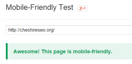 [/su_column] [su_column size=”1/2″]
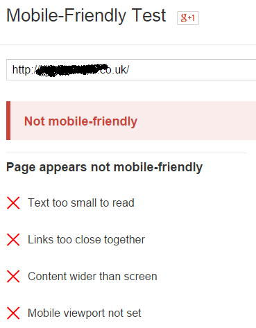 [/su_column][/su_row]
I Failed the Mobile-Friendly test – Help!
Don’t panic if you fail. First, check the reasons why. It may be your robots.txt file is blocking Google, or it was a bad test. Always check at least 3 times to ensure a solid result.
If you definitely have a non-mobile-friendly site, you need to convert it to one that is. Quite often, this involves getting a responsive theme. Responsive simply means the site will adjust (and respond!) depending on what device is viewing it. For example, this is a non-responsive site:

You can see how the unresponsive site simply shrinks the page to fit the screen – making the text smaller, and information bunched together. You would have to zoom in/out and scroll left/right to see everything. The responsive site, however, adjusts the size of the text, and the elements on the screen get moved and prioritised so the user simply scrolls up and down and is able to read and click on items at ease. A much better experience overall!
If you have a web designer, ask them to ensure the site is mobile-friendly. If you did the site yourself, then first check if it is on a CMS (Content Management System). A CMS is a platform, rather than pure HTML based sites. For example, this site is a WordPress one. It means I can just switch which theme my site is using at the touch of a button, and most CMS providers will also allow you to do the same. If you’re unsure, just ask their support team to help you. This should mean it is a free upgrade for you, providing they have free responsive themes!
One quick note – just because a theme or mobile site is labelled responsive, doesn’t necessarily mean it is mobile-friendly. Always check using Google’s tool above that it passes. Don’t bother with 3rd-party tools, because if they say it works, and Google doesn’t, guess who makes the final decision? Yep, exactly.
Anything else I should be aware of?
Possibly. We know Google wants to push mobile-friendly websites, and the majority believe for this update you just need to ensure your site is to pass the main test. But in future, I’d expect Google to introduce more assessments against mobile sites, for instance:
- How fast does it load on a mobile device?
- Is the content loading properly?
- Is the ‘tap-target‘ sized optimally?
- Are images optimised for all devices?
Conclusion
This updates is huge, but it isn’t impossible to get your site ready. The changes should be easy for most people to get corrected, unlike with Penguin where you had to go through a lengthy process of disavowing dodgy links. I also think it’s key to focus on the positive with this too – many business owners and your competition won’t have a clue what is happening or what to do – you can get ahead of the game, and take more business as they all drop like flys on the 21st! So what are you waiting for – seize that competitive advantage today!
If you want more information, speak to one of our Cheshire Search Engine experts today!
What are your thoughts on this new update? Are you mobile-friendly? What do you think the new update will actually do? Let us know your thoughts!